Over the last five years at Strata Identity, I designed the interface for their cloud based next-generation security and identity SaaS orchestration platform – Maverics Identity. Progressing the company from wire-frames, through hi-fidelity pages and ultimately into a live product used by customers such as Kroger, Motorola, Nokia and 3M.
In early 2020 I was hand picked and brought on as part of a small team at Strata Identity that was tasked with building an interface for their product Maverics, which at the time was an open source command line project with no graphical user interface of any kind. We had a team of two designers, a technical project lead and a small group of back-end dev/engineers.
The process began with our team learning the application, documenting features, choosing priorities and collecting what we needed to begin the process of wire-framing pages and exploring the user flows. These user experiments and early research made it possible for us to take what we had learned and turn them into useable designs, and to turn features into categories for creating our user navigation.
Initially, the company had preferred the application be designed as a multi-step form guided flow. Our design team had a preference and examples of a more user friendly and traditional left hand navigation with card style control panels on the right. The ability to keep all of the your configuration viewable on one page was priority for us. We also chose to have the configurations editing be live in a drawer; with always editable fields and on the right side of the same page. This new user interface was a huge improvement over the previous and was quickly adopted by the executive team and approved by the engineering team and what was put in place as the live product.
Taking an existing application that was configured manually on a command line to wireframes in Miro. Then taking that to a hi-fidelity user interface built in Figma using a clean design hierarchy (foundation, atoms, molecules, organisms, etc).
Taking the designs even further; from hi-fidelity pages to well thought out but complex user flows, and from basic design standards to a fully scalable design system of components, variants, colors, modes, states, templates, pages, navigation and all of our foundational design elements.
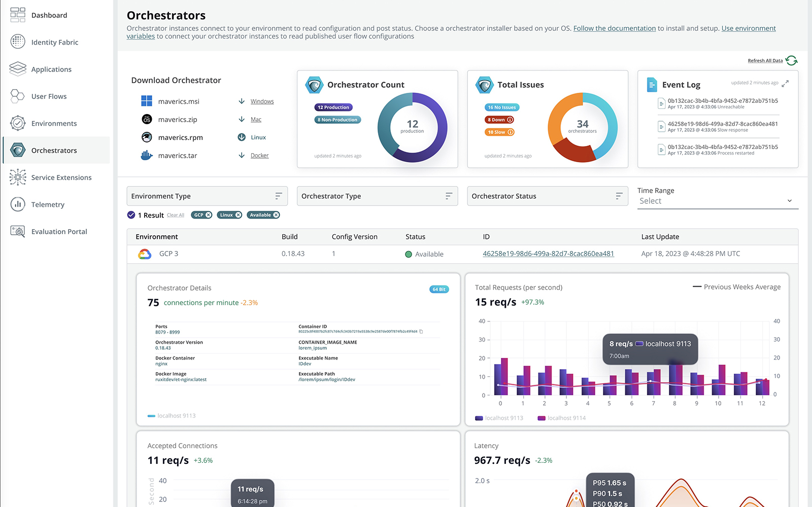
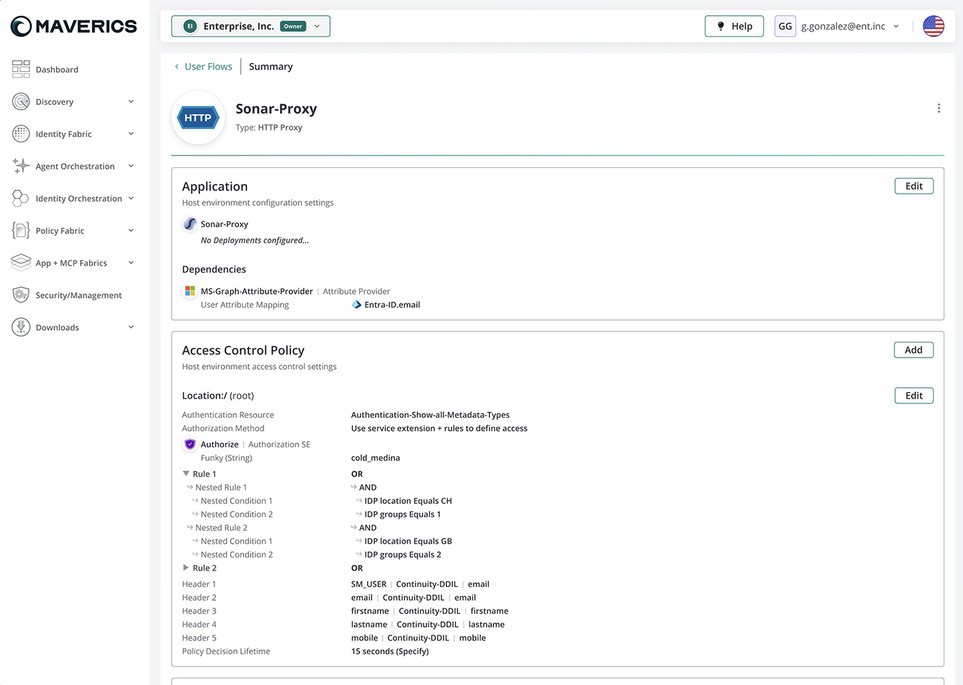
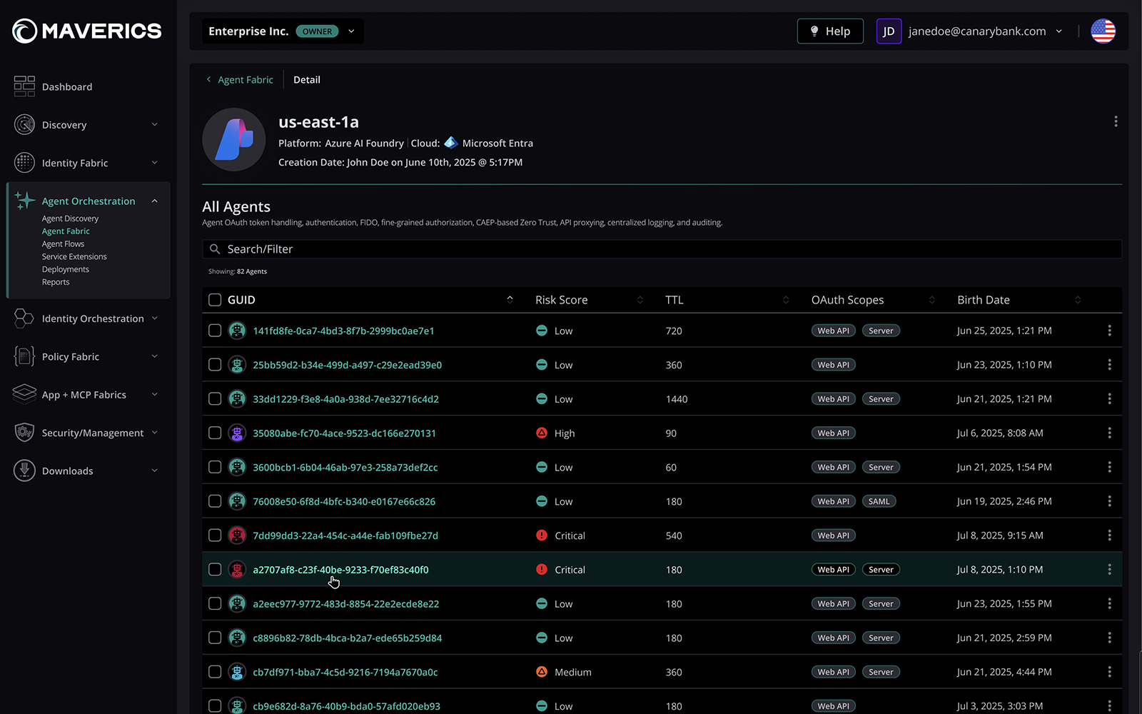
Creating effective pages and navigation while responding to changes from within the code as well as the constant addition of features had us continually iterating on and improving the user experience.
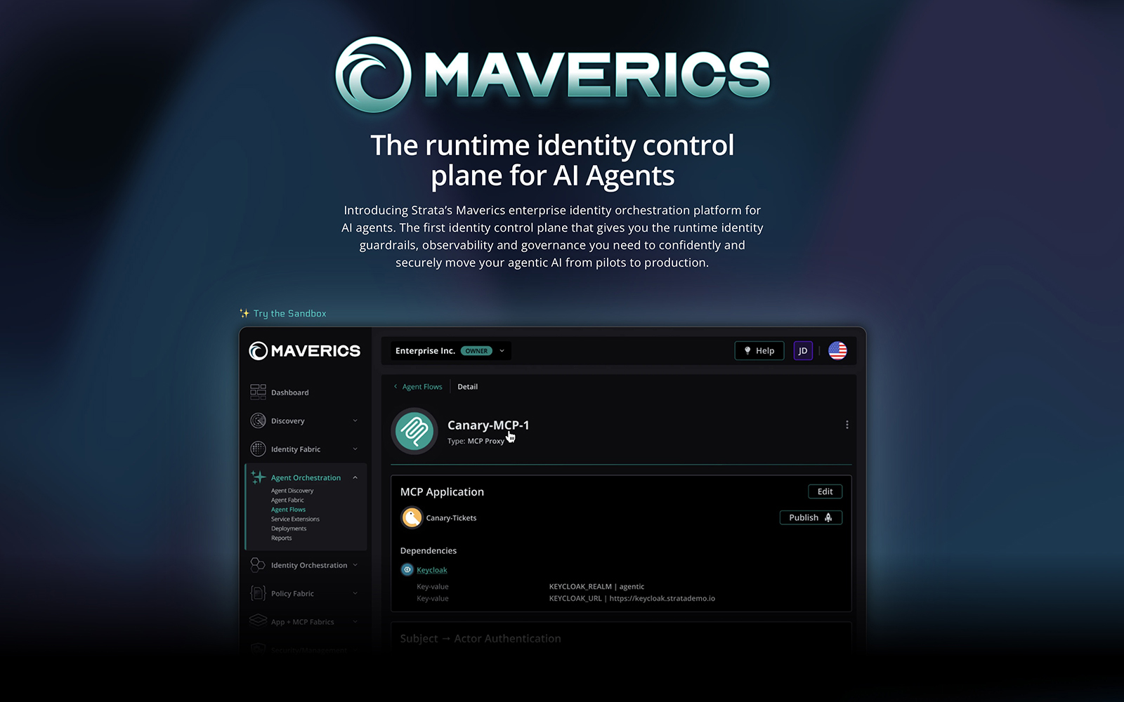
Providing development and engineering what they need for a constantly maintained and updated live product, this includes hi-fidelity pages, complex user flows, figma prototypes, custom react design systems, custom color systems in original, dark and light modes and much more.
Supporting internal teams with clean design elements and standards as well as finished pages, flows and design systems.
720-320-1030
taikahn@gmail.com